Figma / Public website reference / Small pieces. Exact decisions.

Small pieces. Exact decisions.

Anatomy, geometry, states, accessibility, and implementation at the point of use.

Complete family inventory →Pricing composition →Editorial shell →

29 local component contracts with live specimens, measured local roots, source comparisons, and copyable contracts. A reconstructed specimen is labeled; it is never presented as Figma’s private component implementation.

Explore rendered control states →

actions / primary-action

Primary action

One primary next step per decision group.

measured root; reconstructed local contract

Measured local geometry

PropertyComputed value
Rendered local box219.265625 × 49.390625 px
Box sizing / display / positionborder-box / inline-flex / static
Padding T / R / B / L12px / 22px / 12px / 22px
Margin T / R / B / L0px / 0px / 0px / 0px
Border T / R / B / L1px solid rgb(0, 0, 0) / 1px solid rgb(0, 0, 0) / 1px solid rgb(0, 0, 0) / 1px solid rgb(0, 0, 0)
Row / column gap8px / 8px
Alignmentcenter / center
Width constraints0px / 100%
Height constraints48px / none
Overflow / transformvisible / none
Type / weight / line box18px / 320 / 23.4px
Font / trackingFigmaSans, FigmaFallback, Arial, sans-serif / normal
Radius / shadow8px / none
Rendered widths 390 / 768 / 1440219.265625 × 49.390625 / 219.265625 × 49.390625 / 219.265625 × 49.390625

Measured at 1440 × 1000 in Chromium with the disclosed fallback font; responsive boxes also sampled at 390 and 768. Values describe this rendered reconstruction. Parent layouts own external gaps; margins and per-side padding are listed separately. Text distances include the CSS line box.

Source comparison and provenance

measured root; reconstructed local contract

Captured source node: .fig-4rcs94; 192.546875 × 46.390625 px at its recorded viewport.

This source capture is distinct from the rendered local dimensions above. Complete variant and state parity remains partial.

.fig-4rcs94{display:-webkit-inline-box;display:-webkit-inline-flex;display:-ms-inline-flexbox;display:inline-flex;-webkit-box-pack:center;-ms-flex-pack:center;-webkit-justify-content:center;justify-content:center;-webkit-text-decoration:none;text-decoration:none;-webkit-text-decoration:none;text-decoration:none;background:none;border:none;-webkit-transition:background 180ms ease-out,box-shadow 180ms ease-out;transition:background 180ms ease-out,box-shadow 180ms ease-out;width:100%;padding:var(--fig-space-12, 0.75rem);border-radius:var(--fig-radius-8, 0.5rem);background:var(--fig-theme-btn-primary-bg, #000000);color:var(--fig-theme-btn-primary-fg, #FFFFFF);padding:var(--fig-space-12, 0.75rem) 1.375rem;display:none;}
.fig-4rcs94:hover{-webkit-text-decoration:none;text-decoration:none;}
.fig-4rcs94 .btn-icon{margin-block:-1.25rem;}
.fig-4rcs94 .btn-inner.has-icon{display:-webkit-box;display:-webkit-flex;display:-ms-flexbox;display:flex;-webkit-align-items:center;-webkit-box-align:center;-ms-flex-align:center;align-items:center;gap:0.25rem;}
.fig-4rcs94 .btn-inner >.btn-builtin-icon{opacity:0;-webkit-transition:opacity 180ms ease-out;transition:opacity 180ms ease-out;}
.fig-4rcs94 .btn-inner .btn-text{text-align:center;-webkit-transition:translate 180ms ease-out;transition:translate 180ms ease-out;display:inline-block;padding-inline:var(--fig-space-4, 0.25rem);}
.fig-4rcs94[data-loading='true'] .btn-inner:not(.no-arrow) .btn-text{-webkit-translate:-0.5625rem;-moz-translate:-0.5625rem;-ms-translate:-0.5625rem;translate:-0.5625rem;}
.fig-4rcs94:hover .btn-inner:not(.no-arrow) .btn-text{-webkit-translate:-0.5625rem;-moz-translate:-0.5625rem;-ms-translate:-0.5625rem;translate:-0.5625rem;}
.fig-4rcs94:hover .btn-inner:not(.no-arrow) >.btn-builtin-icon{opacity:1;}
.fig-4rcs94{width:auto;}
.fig-4rcs94 .btn-inner .btn-icon>svg{width:1.25rem;height:1.25rem;}
.fig-4rcs94:hover,.fig-4rcs94:active{background:var(--fig-theme-btn-primary-bg-hover, color-mix(in oklch, #000000, transparent 15%));}
.fig-4rcs94{display:block;}

Behavior & composition

Native link/button. Enter activates; Space activates buttons. Hover reveals the arrow; focus ring stays outside the border. Disabled buttons do not dispatch. Loading retains label and width.

Grid margins: 16px small, 24px medium, 40px large; 4 columns small, 12 medium/large; gutter16px. Stack at 1024px for hero and 768px for catalogs.

States: default, hover, focus, active, disabled, loading.

Use: One primary next step per decision group.

Avoid: Do not use the visual shape to imply an unsupported mutation, permission, or authenticated editor action.

Contract

<a data-component="primary-action">…</a>

Required: stable ID and a visible label or accessible name. Native events; ephemeral local state. No account mutation or analytics.

Source selector .fig-4rcs94 · Structured contract · Local CSS · Evidence boundary
actions / secondary-action

Secondary action

Supporting destination beside the primary action.

measured root; reconstructed local contract

Measured local geometry

PropertyComputed value
Rendered local box219.265625 × 49.390625 px
Box sizing / display / positionborder-box / inline-flex / static
Padding T / R / B / L12px / 22px / 12px / 22px
Margin T / R / B / L0px / 0px / 0px / 0px
Border T / R / B / L1px solid rgb(214, 214, 214) / 1px solid rgb(214, 214, 214) / 1px solid rgb(214, 214, 214) / 1px solid rgb(214, 214, 214)
Row / column gap8px / 8px
Alignmentcenter / center
Width constraints0px / 100%
Height constraints48px / none
Overflow / transformvisible / none
Type / weight / line box18px / 320 / 23.4px
Font / trackingFigmaSans, FigmaFallback, Arial, sans-serif / normal
Radius / shadow8px / none
Rendered widths 390 / 768 / 1440219.265625 × 49.390625 / 219.265625 × 49.390625 / 219.265625 × 49.390625

Measured at 1440 × 1000 in Chromium with the disclosed fallback font; responsive boxes also sampled at 390 and 768. Values describe this rendered reconstruction. Parent layouts own external gaps; margins and per-side padding are listed separately. Text distances include the CSS line box.

Source comparison and provenance

measured root; reconstructed local contract

Captured source node: .fig-42wdr4; 151.40625 × 46.390625 px at its recorded viewport.

This source capture is distinct from the rendered local dimensions above. Complete variant and state parity remains partial.

.fig-42wdr4{display:-webkit-inline-box;display:-webkit-inline-flex;display:-ms-inline-flexbox;display:inline-flex;-webkit-box-pack:center;-ms-flex-pack:center;-webkit-justify-content:center;justify-content:center;-webkit-text-decoration:none;text-decoration:none;-webkit-text-decoration:none;text-decoration:none;background:none;border:none;-webkit-transition:background 180ms ease-out,box-shadow 180ms ease-out;transition:background 180ms ease-out,box-shadow 180ms ease-out;width:100%;padding:var(--fig-space-12, 0.75rem);border-radius:var(--fig-radius-8, 0.5rem);background:var(--fig-theme-btn-secondary-bg, color-mix(in oklch, #000000, transparent 100%));box-shadow:inset 0 0 0 1px var(--fig-theme-border, color-mix(in oklch, #000000, transparent 84%));color:var(--fig-theme-btn-secondary-fg, #000000);padding:var(--fig-space-12, 0.75rem) 1.375rem;font-family:var(--global-font-sans, 'figmaSans', 'figmaSans Fallback', SF Pro Display, system-ui, helvetica, sans-serif);font-optical-sizing:auto;font-size:var(--fig-typography-size-body);line-height:var(--fig-typography-lh-loose);letter-spacing:var(--fig-typography-ls-none);font-weight:var(--fig-typography-weight);font-variation-settings:"wdth" var(--fig-typography-variation-wdth-narrow),"wght" var(--fig-typography-variation-wght-regular);display:none;}
.fig-42wdr4:hover{-webkit-text-decoration:none;text-decoration:none;}
.fig-42wdr4 .btn-icon{margin-block:-1.25rem;}
.fig-42wdr4 .btn-inner.has-icon{display:-webkit-box;display:-webkit-flex;display:-ms-flexbox;display:flex;-webkit-align-items:center;-webkit-box-align:center;-ms-flex-align:center;align-items:center;gap:0.25rem;}
.fig-42wdr4 .btn-inner >.btn-builtin-icon{opacity:0;-webkit-transition:opacity 180ms ease-out;transition:opacity 180ms ease-out;}
.fig-42wdr4 .btn-inner .btn-text{text-align:center;-webkit-transition:translate 180ms ease-out;transition:translate 180ms ease-out;display:inline-block;padding-inline:var(--fig-space-4, 0.25rem);}
.fig-42wdr4[data-loading='true'] .btn-inner:not(.no-arrow) .btn-text{-webkit-translate:-0.5625rem;-moz-translate:-0.5625rem;-ms-translate:-0.5625rem;translate:-0.5625rem;}
.fig-42wdr4:hover .btn-inner:not(.no-arrow) .btn-text{-webkit-translate:-0.5625rem;-moz-translate:-0.5625rem;-ms-translate:-0.5625rem;translate:-0.5625rem;}
.fig-42wdr4:hover .btn-inner:not(.no-arrow) >.btn-builtin-icon{opacity:1;}
.fig-42wdr4{width:auto;}
.fig-42wdr4 .btn-inner .btn-icon>svg{width:1.25rem;height:1.25rem;}
.fig-42wdr4:hover,.fig-42wdr4:active{box-shadow:inset 0 0 0 1px var(--fig-theme-border-hover, color-mix(in oklch, #000000, transparent 60%));}
.fig-42wdr4 em{font-variation-settings:"wdth" var(--fig-typography-variation-wdth-narrow),"wght" var(--fig-typography-variation-wght-regular),"slnt" var(--fig-typography-variation-slnt-italic);}
.fig-42wdr4 strong{font-weight:var(--fig-typography-weight);font-variation-settings:"wdth" var(--fig-typography-variation-wdth-narrow),"wght" var(--fig-typography-variation-wght-bold);}
.fig-42wdr4 strong em{font-variation-settings:"wdth" var(--fig-typography-variation-wdth-narrow),"wght" var(--fig-typography-variation-wght-bold),"slnt" var(--fig-typography-variation-slnt-italic);}

Behavior & composition

Native link/button. Enter activates; Space activates buttons. Hover reveals the arrow; focus ring stays outside the border. Disabled buttons do not dispatch. Loading retains label and width.

Grid margins: 16px small, 24px medium, 40px large; 4 columns small, 12 medium/large; gutter16px. Stack at 1024px for hero and 768px for catalogs.

States: default, hover, focus, active, disabled, loading.

Use: Supporting destination beside the primary action.

Avoid: Do not use the visual shape to imply an unsupported mutation, permission, or authenticated editor action.

Contract

<a data-component="secondary-action">…</a>

Required: stable ID and a visible label or accessible name. Native events; ephemeral local state. No account mutation or analytics.

Source selector .fig-42wdr4 · Structured contract · Local CSS · Evidence boundary

type / hero-title

Hero title

Owns the single page-level heading and its editorial line breaks.

measured root; reconstructed local contract

Make room for the next idea.

Measured local geometry

PropertyComputed value
Rendered local box1262 × 56 px
Box sizing / display / positionborder-box / block / static
Padding T / R / B / L0px / 0px / 0px / 0px
Margin T / R / B / L0px / 0px / 0px / 0px
Border T / R / B / L0px none rgb(0, 0, 0) / 0px none rgb(0, 0, 0) / 0px none rgb(0, 0, 0) / 0px none rgb(0, 0, 0)
Row / column gapnormal / normal
Alignmentnormal / normal
Width constraints0px / 2292.17px
Height constraints0px / none
Overflow / transformvisible / none
Type / weight / line box56px / 320 / 56px
Font / trackingFigmaSans, FigmaFallback, Arial, sans-serif / -1.25px
Radius / shadow0px / none
Rendered widths 390 / 768 / 1440308 × 80 / 622 × 112 / 1262 × 56

Measured at 1440 × 1000 in Chromium with the disclosed fallback font; responsive boxes also sampled at 390 and 768. Values describe this rendered reconstruction. Parent layouts own external gaps; margins and per-side padding are listed separately. Text distances include the CSS line box.

Source comparison and provenance

measured root; reconstructed local contract

Captured source node: .fig-1gqvcgs; 328 × 224 px at its recorded viewport.

This source capture is distinct from the rendered local dimensions above. Complete variant and state parity remains partial.

.fig-1gqvcgs{font-family:var(--global-font-sans, 'figmaSans', 'figmaSans Fallback', SF Pro Display, system-ui, helvetica, sans-serif);font-optical-sizing:auto;font-size:var(--fig-typography-size-title1);line-height:var(--fig-typography-lh-none);letter-spacing:var(--fig-typography-ls-tight);font-weight:var(--fig-typography-weight);font-variation-settings:"wdth" var(--fig-typography-variation-wdth-condensed),"wght" var(--fig-typography-variation-wght-regular);margin:0;}
.fig-1gqvcgs strong{font-weight:var(--fig-typography-weight);font-variation-settings:"wdth" var(--fig-typography-variation-wdth-condensed),"wght" var(--fig-typography-variation-wght-regular);}

Behavior & composition

Keep semantic heading order. Wrap text naturally; do not truncate headings. Text zoom and translated strings may increase height.

Grid margins: 16px small, 24px medium, 40px large; 4 columns small, 12 medium/large; gutter16px. Stack at 1024px for hero and 768px for catalogs.

States: default, long-content, missing-content.

Use: Owns the single page-level heading and its editorial line breaks.

Avoid: Do not use the visual shape to imply an unsupported mutation, permission, or authenticated editor action.

Contract

<h1 data-component="hero-title">…</h1>

Required: stable ID and a visible label or accessible name. Native events; ephemeral local state. No account mutation or analytics.

Source selector .fig-1gqvcgs · Structured contract · Local CSS · Evidence boundary

surfaces / hero-section

Hero section

Combines a headline, demonstration canvas, and next action.

measured root; reconstructed local contract

Every idea starts somewhere.

Frozen Figma homepage creative canvasExplore

Measured local geometry

PropertyComputed value
Rendered local box1262 × 404.671875 px
Box sizing / display / positionborder-box / grid / static
Padding T / R / B / L0px / 0px / 0px / 0px
Margin T / R / B / L0px / 0px / 0px / 0px
Border T / R / B / L0px none rgb(0, 0, 0) / 0px none rgb(0, 0, 0) / 0px none rgb(0, 0, 0) / 0px none rgb(0, 0, 0)
Row / column gap24px / 24px
Alignmentcenter / normal
Width constraints0px / none
Height constraints0px / none
Overflow / transformvisible / none
Type / weight / line box16px / 320 / 23.2px
Font / trackingFigmaSans, FigmaFallback, Arial, sans-serif / normal
Radius / shadow0px / none
Rendered widths 390 / 768 / 1440308 × 399.765625 / 622 × 372.390625 / 1262 × 404.671875

Measured at 1440 × 1000 in Chromium with the disclosed fallback font; responsive boxes also sampled at 390 and 768. Values describe this rendered reconstruction. Parent layouts own external gaps; margins and per-side padding are listed separately. Text distances include the CSS line box.

Source comparison and provenance

measured root; reconstructed local contract

Captured source node: .fig-1id9bz1; 1440 × 860 px at its recorded viewport.

This source capture is distinct from the rendered local dimensions above. Complete variant and state parity remains partial.

.fig-1id9bz1{background:var(--fig-theme-bg, #FFFFFF);color:var(--fig-theme-fg, #000000);padding-block:var(--fig-section-block-padding, var(--fig-space-32, 2rem));}

Behavior & composition

Parent grid owns outer spacing; children own internal padding. Preserve DOM order when stacking.

Grid margins: 16px small, 24px medium, 40px large; 4 columns small, 12 medium/large; gutter16px. Stack at 1024px for hero and 768px for catalogs.

States: default, long-content, missing-content.

Use: Combines a headline, demonstration canvas, and next action.

Avoid: Do not use the visual shape to imply an unsupported mutation, permission, or authenticated editor action.

Contract

<section data-component="hero-section">…</section>

Required: stable ID and a visible label or accessible name. Native events; ephemeral local state. No account mutation or analytics.

Source selector .fig-1id9bz1 · Structured contract · Local CSS · Evidence boundary

actions / large-action

Large hero action

Larger action for the sparse hero composition.

measured root; reconstructed local contract

Measured local geometry

PropertyComputed value
Rendered local box365.515625 × 86 px
Box sizing / display / positionborder-box / inline-flex / static
Padding T / R / B / L24px / 40px / 24px / 40px
Margin T / R / B / L0px / 0px / 0px / 0px
Border T / R / B / L1px solid rgb(0, 0, 0) / 1px solid rgb(0, 0, 0) / 1px solid rgb(0, 0, 0) / 1px solid rgb(0, 0, 0)
Row / column gap8px / 8px
Alignmentcenter / center
Width constraints0px / 100%
Height constraints84px / none
Overflow / transformvisible / none
Type / weight / line box30px / 320 / 36px
Font / trackingFigmaSans, FigmaFallback, Arial, sans-serif / normal
Radius / shadow16px / none
Rendered widths 390 / 768 / 1440308 × 122 / 365.515625 × 86 / 365.515625 × 86

Measured at 1440 × 1000 in Chromium with the disclosed fallback font; responsive boxes also sampled at 390 and 768. Values describe this rendered reconstruction. Parent layouts own external gaps; margins and per-side padding are listed separately. Text distances include the CSS line box.

Source comparison and provenance

measured root; reconstructed local contract

Captured source node: .fig-1ytmgio; 224.03125 × 84 px at its recorded viewport.

This source capture is distinct from the rendered local dimensions above. Complete variant and state parity remains partial.

.fig-1ytmgio{display:-webkit-inline-box;display:-webkit-inline-flex;display:-ms-inline-flexbox;display:inline-flex;-webkit-box-pack:center;-ms-flex-pack:center;-webkit-justify-content:center;justify-content:center;-webkit-text-decoration:none;text-decoration:none;-webkit-text-decoration:none;text-decoration:none;background:none;border:none;-webkit-transition:background 180ms ease-out,box-shadow 180ms ease-out;transition:background 180ms ease-out,box-shadow 180ms ease-out;width:100%;padding:var(--fig-space-24, 1.5rem);border-radius:var(--fig-radius-16, 1rem);background:var(--fig-theme-btn-primary-bg, #000000);color:var(--fig-theme-btn-primary-fg, #FFFFFF);padding:var(--fig-space-24, 1.5rem) var(--fig-space-32, 2rem);}
.fig-1ytmgio:hover{-webkit-text-decoration:none;text-decoration:none;}
.fig-1ytmgio .btn-icon{margin-block:-1.25rem;}
.fig-1ytmgio .btn-inner.has-icon{display:-webkit-box;display:-webkit-flex;display:-ms-flexbox;display:flex;-webkit-align-items:center;-webkit-box-align:center;-ms-flex-align:center;align-items:center;gap:0.25rem;}
.fig-1ytmgio .btn-inner >.btn-builtin-icon{opacity:0;-webkit-transition:opacity 180ms ease-out;transition:opacity 180ms ease-out;}
.fig-1ytmgio .btn-inner .btn-text{text-align:center;-webkit-transition:translate 180ms ease-out;transition:translate 180ms ease-out;display:inline-block;padding-inline:var(--fig-space-8, 0.5rem);}
.fig-1ytmgio[data-loading='true'] .btn-inner:not(.no-arrow) .btn-text{-webkit-translate:-1rem;-moz-translate:-1rem;-ms-translate:-1rem;translate:-1rem;}
.fig-1ytmgio:hover .btn-inner:not(.no-arrow) .btn-text{-webkit-translate:-1rem;-moz-translate:-1rem;-ms-translate:-1rem;translate:-1rem;}
.fig-1ytmgio:hover .btn-inner:not(.no-arrow) >.btn-builtin-icon{opacity:1;}
.fig-1ytmgio{width:auto;}
.fig-1ytmgio .btn-inner .btn-icon>svg{width:2.25rem;height:2.25rem;}
.fig-1ytmgio:hover,.fig-1ytmgio:active{background:var(--fig-theme-btn-primary-bg-hover, color-mix(in oklch, #000000, transparent 15%));}

Behavior & composition

Native link/button. Enter activates; Space activates buttons. Hover reveals the arrow; focus ring stays outside the border. Disabled buttons do not dispatch. Loading retains label and width.

Grid margins: 16px small, 24px medium, 40px large; 4 columns small, 12 medium/large; gutter16px. Stack at 1024px for hero and 768px for catalogs.

States: default, hover, focus, active, disabled, loading.

Use: Larger action for the sparse hero composition.

Avoid: Do not use the visual shape to imply an unsupported mutation, permission, or authenticated editor action.

Contract

<a data-component="large-action">…</a>

Required: stable ID and a visible label or accessible name. Native events; ephemeral local state. No account mutation or analytics.

Source selector .fig-1ytmgio · Structured contract · Local CSS · Evidence boundary

type / section-title

Section title

Introduces one section; visual size and semantic level are separate.

measured root; reconstructed local contract

Make room for the next idea.

Measured local geometry

PropertyComputed value
Rendered local box1262 × 48.390625 px
Box sizing / display / positionborder-box / block / static
Padding T / R / B / L0px / 0px / 0px / 0px
Margin T / R / B / L0px / 0px / 0px / 0px
Border T / R / B / L0px none rgb(0, 0, 0) / 0px none rgb(0, 0, 0) / 0px none rgb(0, 0, 0) / 0px none rgb(0, 0, 0)
Row / column gapnormal / normal
Alignmentnormal / normal
Width constraints0px / none
Height constraints0px / none
Overflow / transformvisible / none
Type / weight / line box44px / 400 / 48.4px
Font / trackingFigmaSans, FigmaFallback, Arial, sans-serif / normal
Radius / shadow0px / none
Rendered widths 390 / 768 / 1440308 × 96.78125 / 622 × 48.390625 / 1262 × 48.390625

Measured at 1440 × 1000 in Chromium with the disclosed fallback font; responsive boxes also sampled at 390 and 768. Values describe this rendered reconstruction. Parent layouts own external gaps; margins and per-side padding are listed separately. Text distances include the CSS line box.

Source comparison and provenance

measured root; reconstructed local contract

Captured source node: .fig-174492g; 901.328125 × 36 px at its recorded viewport.

This source capture is distinct from the rendered local dimensions above. Complete variant and state parity remains partial.

.fig-174492g{font-family:var(--global-font-sans, 'figmaSans', 'figmaSans Fallback', SF Pro Display, system-ui, helvetica, sans-serif);font-optical-sizing:auto;font-size:var(--fig-typography-size-title3);line-height:var(--fig-typography-lh-snug);letter-spacing:var(--fig-typography-ls-standard);font-weight:var(--fig-typography-weight);font-variation-settings:"wdth" var(--fig-typography-variation-wdth-narrow),"wght" var(--fig-typography-variation-wght-regular);margin:0;}
.fig-174492g strong{font-weight:var(--fig-typography-weight);font-variation-settings:"wdth" var(--fig-typography-variation-wdth-narrow),"wght" var(--fig-typography-variation-wght-regular);}

Behavior & composition

Keep semantic heading order. Wrap text naturally; do not truncate headings. Text zoom and translated strings may increase height.

Grid margins: 16px small, 24px medium, 40px large; 4 columns small, 12 medium/large; gutter16px. Stack at 1024px for hero and 768px for catalogs.

States: default, long-content, missing-content.

Use: Introduces one section; visual size and semantic level are separate.

Avoid: Do not use the visual shape to imply an unsupported mutation, permission, or authenticated editor action.

Contract

<h2 data-component="section-title">…</h2>

Required: stable ID and a visible label or accessible name. Native events; ephemeral local state. No account mutation or analytics.

Source selector .fig-174492g · Structured contract · Local CSS · Evidence boundary

collections / feature-card

Feature card

Names one benefit with a meaningful image and destination.

measured root; reconstructed local contract

Measured local geometry

PropertyComputed value
Rendered local box390 × 364.5625 px
Box sizing / display / positionborder-box / block / static
Padding T / R / B / L24px / 24px / 24px / 24px
Margin T / R / B / L0px / 0px / 0px / 0px
Border T / R / B / L0px none rgb(0, 0, 0) / 0px none rgb(0, 0, 0) / 0px none rgb(0, 0, 0) / 0px none rgb(0, 0, 0)
Row / column gapnormal / normal
Alignmentnormal / normal
Width constraints0px / 390px
Height constraints0px / none
Overflow / transformvisible / none
Type / weight / line box16px / 320 / 23.2px
Font / trackingFigmaSans, FigmaFallback, Arial, sans-serif / normal
Radius / shadow0px / none
Rendered widths 390 / 768 / 1440308 × 395.75 / 390 × 364.5625 / 390 × 364.5625

Measured at 1440 × 1000 in Chromium with the disclosed fallback font; responsive boxes also sampled at 390 and 768. Values describe this rendered reconstruction. Parent layouts own external gaps; margins and per-side padding are listed separately. Text distances include the CSS line box.

Source comparison and provenance

measured named public source variant; different local reconstruction; see geometry-repairs.json

Captured source node: article.fig-nvjutl; 533.328125 × 117.171875 px at its recorded viewport.

This source capture is distinct from the rendered local dimensions above. Complete variant and state parity remains partial.

.fig-nvjutl {margin-inline-end: var(--fig-space-24, 1.5rem); max-width: 40.625rem; margin-top: var(--fig-space-32, 2rem);}
@media (min-width: 480px) {.fig-nvjutl {margin-top: var(--fig-space-40, 2.5rem);}}

Behavior & composition

Stable IDs. Keep source order in stacked layouts. No selection or drag is implied by a card. Empty and filtered-empty messages name the recovery.

Grid margins: 16px small, 24px medium, 40px large; 4 columns small, 12 medium/large; gutter16px. Stack at 1024px for hero and 768px for catalogs.

States: default, long-content, missing-content.

Use: Names one benefit with a meaningful image and destination.

Avoid: Do not use the visual shape to imply an unsupported mutation, permission, or authenticated editor action.

Contract

<article data-component="feature-card">…</article>

Required: stable ID and a visible label or accessible name. Native events; ephemeral local state. No account mutation or analytics.

Source selector article.fig-nvjutl · Structured contract · Local CSS · Evidence boundary

media / media-frame

Product media

Uses actual product evidence, with alternative text and a missing-media fallback.

measured root; reconstructed local contract
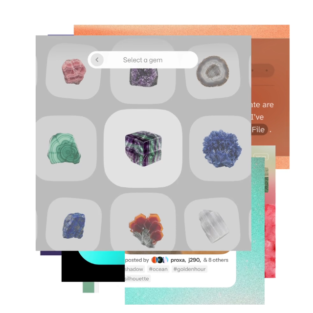
Layered product artwork captured from the Figma homepage
Frozen homepage media frame · observed appearance

Measured local geometry

PropertyComputed value
Rendered local box1262 × 466.484375 px
Box sizing / display / positionborder-box / block / static
Padding T / R / B / L0px / 0px / 0px / 0px
Margin T / R / B / L0px / 0px / 0px / 0px
Border T / R / B / L0px none rgb(0, 0, 0) / 0px none rgb(0, 0, 0) / 0px none rgb(0, 0, 0) / 0px none rgb(0, 0, 0)
Row / column gapnormal / normal
Alignmentnormal / normal
Width constraints0px / none
Height constraints0px / none
Overflow / transformvisible / none
Type / weight / line box16px / 320 / 23.2px
Font / trackingFigmaSans, FigmaFallback, Arial, sans-serif / normal
Radius / shadow0px / none
Rendered widths 390 / 768 / 1440308 × 354.78125 / 622 × 466.484375 / 1262 × 466.484375

Measured at 1440 × 1000 in Chromium with the disclosed fallback font; responsive boxes also sampled at 390 and 768. Values describe this rendered reconstruction. Parent layouts own external gaps; margins and per-side padding are listed separately. Text distances include the CSS line box.

Source comparison and provenance

measured named public source variant; different local reconstruction; see geometry-repairs.json

Captured source node: ul.fig-1ka71ms > li:nth-child(1); 348 × 435 px at its recorded viewport.

This source capture is distinct from the rendered local dimensions above. Complete variant and state parity remains partial.

.fig-1ka71ms {list-style: none; margin-right: 0px; margin-bottom: 0px; margin-left: 0px; padding: 0px; display: grid; grid-template-columns: repeat(2, minmax(0px, 1fr)); gap: var(--fig-grid-gutter); margin-top: var(--fig-space-40, 2.5rem);}
@media (min-width: 1024px) {.fig-1ka71ms {grid-template-columns: repeat(4, minmax(0px, 1fr));}}

Behavior & composition

Static research frame. No autoplay in the guide. Product playback is recorded separately; a screenshot does not prove player behavior.

Grid margins: 16px small, 24px medium, 40px large; 4 columns small, 12 medium/large; gutter16px. Stack at 1024px for hero and 768px for catalogs.

States: default, long-content, missing-content.

Use: Uses actual product evidence, with alternative text and a missing-media fallback.

Avoid: Do not use the visual shape to imply an unsupported mutation, permission, or authenticated editor action.

Contract

<figure data-component="media-frame">…</figure>

Required: stable ID and a visible label or accessible name. Native events; ephemeral local state. No account mutation or analytics.

Source selector ul.fig-1ka71ms > li:nth-child(1) · Structured contract · Local CSS · Evidence boundary

actions / icon-button

Icon button

A compact action requires an accessible name and visible focus.

measured root; reconstructed local contract

Measured local geometry

PropertyComputed value
Rendered local box44 × 44 px
Box sizing / display / positionborder-box / inline-grid / static
Padding T / R / B / L1px / 6px / 1px / 6px
Margin T / R / B / L0px / 0px / 0px / 0px
Border T / R / B / L1px solid rgb(214, 214, 214) / 1px solid rgb(214, 214, 214) / 1px solid rgb(214, 214, 214) / 1px solid rgb(214, 214, 214)
Row / column gapnormal / normal
Alignmentcenter / normal
Width constraints0px / none
Height constraints0px / none
Overflow / transformvisible / none
Type / weight / line box24px / 320 / 34.8px
Font / trackingFigmaSans, FigmaFallback, Arial, sans-serif / normal
Radius / shadow50% / none
Rendered widths 390 / 768 / 144044 × 44 / 44 × 44 / 44 × 44

Measured at 1440 × 1000 in Chromium with the disclosed fallback font; responsive boxes also sampled at 390 and 768. Values describe this rendered reconstruction. Parent layouts own external gaps; margins and per-side padding are listed separately. Text distances include the CSS line box.

Source comparison and provenance

measured named public source variant; different local reconstruction; see geometry-repairs.json

Captured source node: button.fig-5vh56z[aria-label="Next slide"]; 36 × 36 px at its recorded viewport.

This source capture is distinct from the rendered local dimensions above. Complete variant and state parity remains partial.

button, input, optgroup, select, textarea {font-family: inherit; font-size: 100%; line-height: 1.15; margin: 0px;}
button, input {overflow: visible;}
button, select {text-transform: none;}
button, [type="button"], [type="reset"], [type="submit"] {appearance: button;}
@media (hover: hover) and (pointer: fine) {a, a *, button:not(.tooltip-btn), button:not(.tooltip-btn) *, select, input[type="checkbox"] {cursor: var(--global-cursor-pointer);}}
button, input, optgroup, select, textarea {font-family: inherit; font-size: 100%; line-height: 1.15; margin: 0px;}
button, input {overflow: visible;}
button, select {text-transform: none;}
button, [type="button"], [type="reset"], [type="submit"] {appearance: button;}
@media (hover: hover) and (pointer: fine) {a, a *, button:not(.tooltip-btn), button:not(.tooltip-btn) *, select, input[type="checkbox"] {cursor: var(--global-cursor-pointer);}}
.fig-5vh56z {text-decoration: none; display: flex; -webkit-box-align: center; align-items: center; -webkit-box-pack: center; justify-content: center; border-width: medium; border-style: none; border-color: currentcolor; border-image: none; max-width: fit-content; transition: background 180ms ease-out, box-shadow 180ms ease-out; background: var(--fig-theme-btn-secondary-bg, color-mix(in oklch, #000000, transparent 100%)); box-shadow: inset 0 0 0 1px var(--fig-theme-border, color-mix(in oklch, #000000, transparent 84%)); color: var(--fig-theme-btn-secondary-fg, #000000); padding: var(--fig-space-8, 0.5rem); border-radius: var(--fig-radius-full, 624.9375rem);}

Behavior & composition

Native link/button. Enter activates; Space activates buttons. Hover reveals the arrow; focus ring stays outside the border. Disabled buttons do not dispatch. Loading retains label and width.

Grid margins: 16px small, 24px medium, 40px large; 4 columns small, 12 medium/large; gutter16px. Stack at 1024px for hero and 768px for catalogs.

States: default, hover, focus, active, disabled, loading.

Use: A compact action requires an accessible name and visible focus.

Avoid: Do not use the visual shape to imply an unsupported mutation, permission, or authenticated editor action.

Contract

<button data-component="icon-button">…</button>

Required: stable ID and a visible label or accessible name. Native events; ephemeral local state. No account mutation or analytics.

Source selector button.fig-5vh56z[aria-label="Next slide"] · Structured contract · Local CSS · Evidence boundary

feedback / badge

Product badge

A short non-interactive lifecycle label such as Beta or New.

reconstructed from inventoried public pattern
Beta New

Measured local geometry

PropertyComputed value
Rendered local box50.859375 × 26.1875 px
Box sizing / display / positionborder-box / inline-flex / static
Padding T / R / B / L4px / 8px / 4px / 8px
Margin T / R / B / L0px / 0px / 0px / 0px
Border T / R / B / L0px none rgb(0, 0, 0) / 0px none rgb(0, 0, 0) / 0px none rgb(0, 0, 0) / 0px none rgb(0, 0, 0)
Row / column gapnormal / normal
Alignmentnormal / normal
Width constraints0px / none
Height constraints0px / none
Overflow / transformvisible / none
Type / weight / line box14px / 320 / 18.2px
Font / trackingFigmaSans, FigmaFallback, Arial, sans-serif / normal
Radius / shadow4px / none
Rendered widths 390 / 768 / 144050.859375 × 26.1875 / 50.859375 × 26.1875 / 50.859375 × 26.1875

Measured at 1440 × 1000 in Chromium with the disclosed fallback font; responsive boxes also sampled at 390 and 768. Values describe this rendered reconstruction. Parent layouts own external gaps; margins and per-side padding are listed separately. Text distances include the CSS line box.

Source comparison and provenance

reconstructed from inventoried public pattern

Captured source node: [data-component="badge"]

This source capture is distinct from the rendered local dimensions above. Complete variant and state parity remains partial.

Behavior & composition

Use text as well as color. Announce updates once through role=status. No timer dismisses essential recovery instructions.

Grid margins: 16px small, 24px medium, 40px large; 4 columns small, 12 medium/large; gutter16px. Stack at 1024px for hero and 768px for catalogs.

States: default, long-content, missing-content.

Use: A short non-interactive lifecycle label such as Beta or New.

Avoid: Do not use the visual shape to imply an unsupported mutation, permission, or authenticated editor action.

Contract

<span data-component="badge">…</span>

Required: stable ID and a visible label or accessible name. Native events; ephemeral local state. No account mutation or analytics.

Source selector [data-component="badge"] · Structured contract · Local CSS · Evidence boundary

navigation / tabs

Section tabs

Shows one panel while keeping the section context.

reconstructed from inventoried public pattern
Explore and refine ideas together.

Measured local geometry

PropertyComputed value
Rendered local box1262 × 54.1875 px
Box sizing / display / positionborder-box / flex / static
Padding T / R / B / L0px / 0px / 0px / 0px
Margin T / R / B / L0px / 0px / 0px / 0px
Border T / R / B / L0px none rgb(0, 0, 0) / 0px none rgb(0, 0, 0) / 1px solid rgb(204, 204, 204) / 0px none rgb(0, 0, 0)
Row / column gap8px / 8px
Alignmentnormal / normal
Width constraints0px / none
Height constraints0px / none
Overflow / transformvisible / none
Type / weight / line box16px / 320 / 23.2px
Font / trackingFigmaSans, FigmaFallback, Arial, sans-serif / normal
Radius / shadow0px / none
Rendered widths 390 / 768 / 1440308 × 54.1875 / 622 × 54.1875 / 1262 × 54.1875

Measured at 1440 × 1000 in Chromium with the disclosed fallback font; responsive boxes also sampled at 390 and 768. Values describe this rendered reconstruction. Parent layouts own external gaps; margins and per-side padding are listed separately. Text distances include the CSS line box.

Source comparison and provenance

reconstructed from inventoried public pattern

Captured source node: [data-component="tabs"]

This source capture is distinct from the rendered local dimensions above. Complete variant and state parity remains partial.

Behavior & composition

Local contract: a tablist controls one named panel. The selected tab labels the panel before interaction and after every selection. Click, Enter, or Space selects a tab; Left/Right arrows wrap between tabs, and Home/End selects the first/last tab. Keyboard selection is automatic and keeps focus on the selected tab. Only that tab is in the page tab order. No expanded/collapsed or Escape behavior is implied.

Grid margins: 16px small, 24px medium, 40px large; 4 columns small, 12 medium/large; gutter16px. Stack at 1024px for hero and 768px for catalogs.

States: design-selected, build-selected, keyboard-focus.

Use: Shows one panel while keeping the section context.

Avoid: Do not use the visual shape to imply an unsupported mutation, permission, or authenticated editor action.

Contract

<div data-component="tabs">…</div>

Required: stable ID and a visible label or accessible name. Native events; ephemeral local state. No account mutation or analytics.

Source selector [data-component="tabs"] · Structured contract · Local CSS · Evidence boundary

navigation / accordion

FAQ disclosure

Reveals one answer using native keyboard interaction.

reconstructed from inventoried public pattern
How should a new variant be added?

Reuse the existing tokens. Name the content and state contract, then add a specimen and a regression assertion before adoption.

Measured local geometry

PropertyComputed value
Rendered local box1262 × 55 px
Box sizing / display / positionborder-box / block / static
Padding T / R / B / L0px / 0px / 0px / 0px
Margin T / R / B / L0px / 0px / 0px / 0px
Border T / R / B / L1px solid rgb(170, 170, 170) / 0px none rgb(0, 0, 0) / 1px solid rgb(170, 170, 170) / 0px none rgb(0, 0, 0)
Row / column gapnormal / normal
Alignmentnormal / normal
Width constraints0px / none
Height constraints0px / none
Overflow / transformvisible / none
Type / weight / line box16px / 320 / 23.2px
Font / trackingFigmaSans, FigmaFallback, Arial, sans-serif / normal
Radius / shadow0px / none
Rendered widths 390 / 768 / 1440308 × 84 / 622 × 55 / 1262 × 55

Measured at 1440 × 1000 in Chromium with the disclosed fallback font; responsive boxes also sampled at 390 and 768. Values describe this rendered reconstruction. Parent layouts own external gaps; margins and per-side padding are listed separately. Text distances include the CSS line box.

Source comparison and provenance

reconstructed from inventoried public pattern

Captured source node: [data-component="accordion"]

This source capture is distinct from the rendered local dimensions above. Complete variant and state parity remains partial.

Behavior & composition

Local contract: native details/summary exposes expanded or collapsed state and toggles with click, Enter, or Space. The closed answer is hidden and untabbable. This inline FAQ does not have the Escape-to-dismiss enhancement used by navigation disclosures.

Grid margins: 16px small, 24px medium, 40px large; 4 columns small, 12 medium/large; gutter16px. Stack at 1024px for hero and 768px for catalogs.

States: expanded, collapsed.

Use: Reveals one answer using native keyboard interaction.

Avoid: Do not use the visual shape to imply an unsupported mutation, permission, or authenticated editor action.

Contract

<details data-component="accordion">…</details>

Required: stable ID and a visible label or accessible name. Native events; ephemeral local state. No account mutation or analytics.

Source selector [data-component="accordion"] · Structured contract · Local CSS · Evidence boundary

forms / search-field

Catalog search

Filters a visible collection; announce result counts and preserve the query.

reconstructed from inventoried public pattern

Search within this specimen.

Measured local geometry

PropertyComputed value
Rendered local box1262 × 76.296875 px
Box sizing / display / positionborder-box / block / static
Padding T / R / B / L0px / 0px / 0px / 0px
Margin T / R / B / L0px / 0px / 0px / 0px
Border T / R / B / L0px none rgb(0, 0, 0) / 0px none rgb(0, 0, 0) / 0px none rgb(0, 0, 0) / 0px none rgb(0, 0, 0)
Row / column gapnormal / normal
Alignmentnormal / normal
Width constraints0px / none
Height constraints0px / none
Overflow / transformvisible / none
Type / weight / line box14px / 320 / 20.3px
Font / trackingFigmaSans, FigmaFallback, Arial, sans-serif / normal
Radius / shadow0px / none
Rendered widths 390 / 768 / 1440308 × 76.296875 / 622 × 76.296875 / 1262 × 76.296875

Measured at 1440 × 1000 in Chromium with the disclosed fallback font; responsive boxes also sampled at 390 and 768. Values describe this rendered reconstruction. Parent layouts own external gaps; margins and per-side padding are listed separately. Text distances include the CSS line box.

Source comparison and provenance

reconstructed from inventoried public pattern

Captured source node: [data-component="search-field"]

This source capture is distinct from the rendered local dimensions above. Complete variant and state parity remains partial.

Behavior & composition

Visible label, native input semantics, helper/error IDs. Validate on submit or explicit blur, preserve entered value, announce completion.

Grid margins: 16px small, 24px medium, 40px large; 4 columns small, 12 medium/large; gutter16px. Stack at 1024px for hero and 768px for catalogs.

States: default, empty, invalid, filled.

Use: Filters a visible collection; announce result counts and preserve the query.

Avoid: Do not use the visual shape to imply an unsupported mutation, permission, or authenticated editor action.

Contract

<input data-component="search-field">…</input>

Required: stable ID and a visible label or accessible name. Native events; ephemeral local state. No account mutation or analytics.

Source selector [data-component="search-field"] · Structured contract · Local CSS · Evidence boundary

forms / filter-control

Collection filter

Narrows the collection by one explicit category.

reconstructed from inventoried public pattern

Measured local geometry

PropertyComputed value
Rendered local box1262 × 76.296875 px
Box sizing / display / positionborder-box / block / static
Padding T / R / B / L0px / 0px / 0px / 0px
Margin T / R / B / L0px / 0px / 0px / 0px
Border T / R / B / L0px none rgb(0, 0, 0) / 0px none rgb(0, 0, 0) / 0px none rgb(0, 0, 0) / 0px none rgb(0, 0, 0)
Row / column gapnormal / normal
Alignmentnormal / normal
Width constraints0px / none
Height constraints0px / none
Overflow / transformvisible / none
Type / weight / line box14px / 320 / 20.3px
Font / trackingFigmaSans, FigmaFallback, Arial, sans-serif / normal
Radius / shadow0px / none
Rendered widths 390 / 768 / 1440308 × 76.296875 / 622 × 76.296875 / 1262 × 76.296875

Measured at 1440 × 1000 in Chromium with the disclosed fallback font; responsive boxes also sampled at 390 and 768. Values describe this rendered reconstruction. Parent layouts own external gaps; margins and per-side padding are listed separately. Text distances include the CSS line box.

Source comparison and provenance

reconstructed from inventoried public pattern

Captured source node: [data-component="filter-control"]

This source capture is distinct from the rendered local dimensions above. Complete variant and state parity remains partial.

Behavior & composition

Visible label, native input semantics, helper/error IDs. Validate on submit or explicit blur, preserve entered value, announce completion.

Grid margins: 16px small, 24px medium, 40px large; 4 columns small, 12 medium/large; gutter16px. Stack at 1024px for hero and 768px for catalogs.

States: default, empty, invalid, filled.

Use: Narrows the collection by one explicit category.

Avoid: Do not use the visual shape to imply an unsupported mutation, permission, or authenticated editor action.

Contract

<select data-component="filter-control">…</select>

Required: stable ID and a visible label or accessible name. Native events; ephemeral local state. No account mutation or analytics.

Source selector [data-component="filter-control"] · Structured contract · Local CSS · Evidence boundary

forms / billing-toggle

Billing switch

Selects monthly or annual display; never initiates a purchase.

reconstructed from inventoried public pattern

Full seat: 16 USD per month

Professional annual billing selected.

See all seats in the full pricing composition →

Measured local geometry

PropertyComputed value
Rendered local box220 × 34 px
Box sizing / display / positionborder-box / flex / static
Padding T / R / B / L3px / 3px / 3px / 3px
Margin T / R / B / L20px / 0px / 24px / 0px
Border T / R / B / L0px none rgb(0, 0, 0) / 0px none rgb(0, 0, 0) / 0px none rgb(0, 0, 0) / 0px none rgb(0, 0, 0)
Row / column gapnormal / normal
Alignmentnormal / normal
Width constraints0px / 220px
Height constraints0px / none
Overflow / transformvisible / none
Type / weight / line box16px / 320 / 23.2px
Font / trackingFigmaSans, FigmaFallback, Arial, sans-serif / normal
Radius / shadow100px / none
Rendered widths 390 / 768 / 1440220 × 34 / 220 × 34 / 220 × 34

Measured at 1440 × 1000 in Chromium with the disclosed fallback font; responsive boxes also sampled at 390 and 768. Values describe this rendered reconstruction. Parent layouts own external gaps; margins and per-side padding are listed separately. Text distances include the CSS line box.

Source comparison and provenance

reconstructed from inventoried public pattern

Captured source node: [data-component="billing-toggle"]

This source capture is distinct from the rendered local dimensions above. Complete variant and state parity remains partial.

Behavior & composition

Visible label, native input semantics, helper/error IDs. Validate on submit or explicit blur, preserve entered value, announce completion.

Grid margins: 16px small, 24px medium, 40px large; 4 columns small, 12 medium/large; gutter16px. Stack at 1024px for hero and 768px for catalogs.

States: default, empty, invalid, filled.

Use: Selects monthly or annual display; never initiates a purchase.

Avoid: Do not use the visual shape to imply an unsupported mutation, permission, or authenticated editor action.

Contract

<input data-component="billing-toggle">…</input>

Required: stable ID and a visible label or accessible name. Native events; ephemeral local state. No account mutation or analytics.

Source selector [data-component="billing-toggle"] · Structured contract · Local CSS · Evidence boundary

collections / plan-card

Plan card

Keeps plan name, seat scope, price unit, and next action together.

reconstructed from inventoried public pattern
For a small team

Professional

$16 / Full seat / month

Annual billing example, captured September 18, 2026. Verify live pricing before purchase.

View current pricing

Measured local geometry

PropertyComputed value
Rendered local box400 × 395.328125 px
Box sizing / display / positionborder-box / block / static
Padding T / R / B / L32px / 32px / 32px / 32px
Margin T / R / B / L0px / 0px / 0px / 0px
Border T / R / B / L1px solid rgb(0, 0, 0) / 1px solid rgb(0, 0, 0) / 1px solid rgb(0, 0, 0) / 1px solid rgb(0, 0, 0)
Row / column gapnormal / normal
Alignmentnormal / normal
Width constraints0px / 400px
Height constraints0px / none
Overflow / transformvisible / none
Type / weight / line box16px / 320 / 23.2px
Font / trackingFigmaSans, FigmaFallback, Arial, sans-serif / normal
Radius / shadow0px / none
Rendered widths 390 / 768 / 1440308 × 418.515625 / 400 × 395.328125 / 400 × 395.328125

Measured at 1440 × 1000 in Chromium with the disclosed fallback font; responsive boxes also sampled at 390 and 768. Values describe this rendered reconstruction. Parent layouts own external gaps; margins and per-side padding are listed separately. Text distances include the CSS line box.

Source comparison and provenance

reconstructed from inventoried public pattern

Captured source node: [data-component="plan-card"]

This source capture is distinct from the rendered local dimensions above. Complete variant and state parity remains partial.

Behavior & composition

Stable IDs. Keep source order in stacked layouts. No selection or drag is implied by a card. Empty and filtered-empty messages name the recovery.

Grid margins: 16px small, 24px medium, 40px large; 4 columns small, 12 medium/large; gutter16px. Stack at 1024px for hero and 768px for catalogs.

States: default, long-content, missing-content.

Use: Keeps plan name, seat scope, price unit, and next action together.

Avoid: Do not use the visual shape to imply an unsupported mutation, permission, or authenticated editor action.

Contract

<article data-component="plan-card">…</article>

Required: stable ID and a visible label or accessible name. Native events; ephemeral local state. No account mutation or analytics.

Source selector [data-component="plan-card"] · Structured contract · Local CSS · Evidence boundary

collections / comparison-table

Comparison table

Compares the same feature across plans with proper headers.

reconstructed from inventoried public pattern
FeatureStarterProfessional
Design filesLimitedUnlimited
Team librariesIncluded

Measured local geometry

PropertyComputed value
Rendered local box1262 × 160.890625 px
Box sizing / display / positionborder-box / block / static
Padding T / R / B / L0px / 0px / 0px / 0px
Margin T / R / B / L0px / 0px / 0px / 0px
Border T / R / B / L0px none rgb(0, 0, 0) / 0px none rgb(0, 0, 0) / 0px none rgb(0, 0, 0) / 0px none rgb(0, 0, 0)
Row / column gapnormal / normal
Alignmentnormal / normal
Width constraints0px / 100%
Height constraints0px / none
Overflow / transformauto / none
Type / weight / line box16px / 320 / 23.2px
Font / trackingFigmaSans, FigmaFallback, Arial, sans-serif / normal
Radius / shadow0px / none
Rendered widths 390 / 768 / 1440308 × 160.890625 / 622 × 160.890625 / 1262 × 160.890625

Measured at 1440 × 1000 in Chromium with the disclosed fallback font; responsive boxes also sampled at 390 and 768. Values describe this rendered reconstruction. Parent layouts own external gaps; margins and per-side padding are listed separately. Text distances include the CSS line box.

Source comparison and provenance

reconstructed from inventoried public pattern

Captured source node: [data-component="comparison-table"]

This source capture is distinct from the rendered local dimensions above. Complete variant and state parity remains partial.

Behavior & composition

Stable IDs. Keep source order in stacked layouts. No selection or drag is implied by a card. Empty and filtered-empty messages name the recovery.

Grid margins: 16px small, 24px medium, 40px large; 4 columns small, 12 medium/large; gutter16px. Stack at 1024px for hero and 768px for catalogs.

States: default, long-content, missing-content.

Use: Compares the same feature across plans with proper headers.

Avoid: Do not use the visual shape to imply an unsupported mutation, permission, or authenticated editor action.

Contract

<table data-component="comparison-table">…</table>

Required: stable ID and a visible label or accessible name. Native events; ephemeral local state. No account mutation or analytics.

Source selector [data-component="comparison-table"] · Structured contract · Local CSS · Evidence boundary

forms / email-field

Newsletter email

Native email validation with linked error and input preservation.

reconstructed from inventoried public pattern

Local validation specimen. No address is sent or saved.

Measured local geometry

PropertyComputed value
Rendered local box480 × 165.984375 px
Box sizing / display / positionborder-box / block / static
Padding T / R / B / L0px / 0px / 0px / 0px
Margin T / R / B / L0px / 0px / 0px / 0px
Border T / R / B / L0px none rgb(0, 0, 0) / 0px none rgb(0, 0, 0) / 0px none rgb(0, 0, 0) / 0px none rgb(0, 0, 0)
Row / column gapnormal / normal
Alignmentnormal / normal
Width constraints0px / 480px
Height constraints0px / none
Overflow / transformvisible / none
Type / weight / line box16px / 320 / 23.2px
Font / trackingFigmaSans, FigmaFallback, Arial, sans-serif / normal
Radius / shadow0px / none
Rendered widths 390 / 768 / 1440308 × 186.28125 / 480 × 165.984375 / 480 × 165.984375

Measured at 1440 × 1000 in Chromium with the disclosed fallback font; responsive boxes also sampled at 390 and 768. Values describe this rendered reconstruction. Parent layouts own external gaps; margins and per-side padding are listed separately. Text distances include the CSS line box.

Source comparison and provenance

reconstructed from inventoried public pattern

Captured source node: [data-component="email-field"]

This source capture is distinct from the rendered local dimensions above. Complete variant and state parity remains partial.

Behavior & composition

Visible label, native input semantics, helper/error IDs. Validate on submit or explicit blur, preserve entered value, announce completion.

Grid margins: 16px small, 24px medium, 40px large; 4 columns small, 12 medium/large; gutter16px. Stack at 1024px for hero and 768px for catalogs.

States: default, empty, invalid, filled.

Use: Native email validation with linked error and input preservation.

Avoid: Do not use the visual shape to imply an unsupported mutation, permission, or authenticated editor action.

Contract

<input data-component="email-field">…</input>

Required: stable ID and a visible label or accessible name. Native events; ephemeral local state. No account mutation or analytics.

Source selector [data-component="email-field"] · Structured contract · Local CSS · Evidence boundary

collections / load-more

Load more

Adds items without resetting the existing collection or keyboard focus.

reconstructed from inventoried public pattern

Design systems · Prototyping · Collaboration

Measured local geometry

PropertyComputed value
Rendered local box1262 × 23.1875 px
Box sizing / display / positionborder-box / block / static
Padding T / R / B / L0px / 0px / 0px / 0px
Margin T / R / B / L0px / 0px / 0px / 0px
Border T / R / B / L0px none rgb(0, 0, 0) / 0px none rgb(0, 0, 0) / 0px none rgb(0, 0, 0) / 0px none rgb(0, 0, 0)
Row / column gapnormal / normal
Alignmentnormal / normal
Width constraints0px / none
Height constraints0px / none
Overflow / transformvisible / none
Type / weight / line box16px / 320 / 23.2px
Font / trackingFigmaSans, FigmaFallback, Arial, sans-serif / normal
Radius / shadow0px / none
Rendered widths 390 / 768 / 1440308 × 46.375 / 622 × 23.1875 / 1262 × 23.1875

Measured at 1440 × 1000 in Chromium with the disclosed fallback font; responsive boxes also sampled at 390 and 768. Values describe this rendered reconstruction. Parent layouts own external gaps; margins and per-side padding are listed separately. Text distances include the CSS line box.

Source comparison and provenance

reconstructed from inventoried public pattern

Captured source node: [data-component="load-more"]

This source capture is distinct from the rendered local dimensions above. Complete variant and state parity remains partial.

Behavior & composition

Stable IDs. Keep source order in stacked layouts. No selection or drag is implied by a card. Empty and filtered-empty messages name the recovery.

Grid margins: 16px small, 24px medium, 40px large; 4 columns small, 12 medium/large; gutter16px. Stack at 1024px for hero and 768px for catalogs.

States: default, long-content, missing-content.

Use: Adds items without resetting the existing collection or keyboard focus.

Avoid: Do not use the visual shape to imply an unsupported mutation, permission, or authenticated editor action.

Contract

<button data-component="load-more">…</button>

Required: stable ID and a visible label or accessible name. Native events; ephemeral local state. No account mutation or analytics.

Source selector [data-component="load-more"] · Structured contract · Local CSS · Evidence boundary

actions / copy-control

Copy value

Copies a token and confirms completion without moving focus.

reconstructed from inventoried public pattern
--fig-space-24: 1.5rem;

Measured local geometry

PropertyComputed value
Rendered local box1262 × 95.4375 px
Box sizing / display / positionborder-box / block / relative
Padding T / R / B / L24px / 24px / 24px / 24px
Margin T / R / B / L24px / 0px / 24px / 0px
Border T / R / B / L1px solid rgb(214, 214, 214) / 1px solid rgb(214, 214, 214) / 1px solid rgb(214, 214, 214) / 1px solid rgb(214, 214, 214)
Row / column gapnormal / normal
Alignmentnormal / normal
Width constraints0px / 100%
Height constraints0px / none
Overflow / transformvisible / none
Type / weight / line box16px / 320 / 23.2px
Font / trackingFigmaSans, FigmaFallback, Arial, sans-serif / normal
Radius / shadow0px / none
Rendered widths 390 / 768 / 1440308 × 95.4375 / 622 × 95.4375 / 1262 × 95.4375

Measured at 1440 × 1000 in Chromium with the disclosed fallback font; responsive boxes also sampled at 390 and 768. Values describe this rendered reconstruction. Parent layouts own external gaps; margins and per-side padding are listed separately. Text distances include the CSS line box.

Source comparison and provenance

reconstructed from inventoried public pattern

Captured source node: [data-component="copy-control"]

This source capture is distinct from the rendered local dimensions above. Complete variant and state parity remains partial.

Behavior & composition

Native link/button. Enter activates; Space activates buttons. Hover reveals the arrow; focus ring stays outside the border. Disabled buttons do not dispatch. Loading retains label and width.

Grid margins: 16px small, 24px medium, 40px large; 4 columns small, 12 medium/large; gutter16px. Stack at 1024px for hero and 768px for catalogs.

States: default, hover, focus, active, disabled, loading.

Use: Copies a token and confirms completion without moving focus.

Avoid: Do not use the visual shape to imply an unsupported mutation, permission, or authenticated editor action.

Contract

<button data-component="copy-control">…</button>

Required: stable ID and a visible label or accessible name. Native events; ephemeral local state. No account mutation or analytics.

Source selector [data-component="copy-control"] · Structured contract · Local CSS · Evidence boundary

forms / locale-control

Language selector

Changes content locale; local reference exposes English and stress-test fixtures only.

reconstructed from inventoried public pattern

Create a shared workspace

Measured local geometry

PropertyComputed value
Rendered local box1262 × 76.296875 px
Box sizing / display / positionborder-box / block / static
Padding T / R / B / L0px / 0px / 0px / 0px
Margin T / R / B / L0px / 0px / 0px / 0px
Border T / R / B / L0px none rgb(0, 0, 0) / 0px none rgb(0, 0, 0) / 0px none rgb(0, 0, 0) / 0px none rgb(0, 0, 0)
Row / column gapnormal / normal
Alignmentnormal / normal
Width constraints0px / none
Height constraints0px / none
Overflow / transformvisible / none
Type / weight / line box14px / 320 / 20.3px
Font / trackingFigmaSans, FigmaFallback, Arial, sans-serif / normal
Radius / shadow0px / none
Rendered widths 390 / 768 / 1440308 × 76.296875 / 622 × 76.296875 / 1262 × 76.296875

Measured at 1440 × 1000 in Chromium with the disclosed fallback font; responsive boxes also sampled at 390 and 768. Values describe this rendered reconstruction. Parent layouts own external gaps; margins and per-side padding are listed separately. Text distances include the CSS line box.

Source comparison and provenance

reconstructed from inventoried public pattern

Captured source node: [data-component="locale-control"]

This source capture is distinct from the rendered local dimensions above. Complete variant and state parity remains partial.

Behavior & composition

Visible label, native input semantics, helper/error IDs. Validate on submit or explicit blur, preserve entered value, announce completion.

Grid margins: 16px small, 24px medium, 40px large; 4 columns small, 12 medium/large; gutter16px. Stack at 1024px for hero and 768px for catalogs.

States: default, empty, invalid, filled.

Use: Changes content locale; local reference exposes English and stress-test fixtures only.

Avoid: Do not use the visual shape to imply an unsupported mutation, permission, or authenticated editor action.

Contract

<select data-component="locale-control">…</select>

Required: stable ID and a visible label or accessible name. Native events; ephemeral local state. No account mutation or analytics.

Source selector [data-component="locale-control"] · Structured contract · Local CSS · Evidence boundary

feedback / status-message

Status message

Announces search, validation, and clipboard results with a polite live region.

reconstructed from inventoried public pattern

The value is ready to copy.

Measured local geometry

PropertyComputed value
Rendered local box654.34375 × 65.1875 px
Box sizing / display / positionborder-box / block / static
Padding T / R / B / L20px / 20px / 20px / 20px
Margin T / R / B / L0px / 0px / 0px / 0px
Border T / R / B / L1px solid rgb(76, 118, 78) / 1px solid rgb(76, 118, 78) / 1px solid rgb(76, 118, 78) / 1px solid rgb(76, 118, 78)
Row / column gapnormal / normal
Alignmentnormal / normal
Width constraints0px / 654.348px
Height constraints0px / none
Overflow / transformvisible / none
Type / weight / line box16px / 320 / 23.2px
Font / trackingFigmaSans, FigmaFallback, Arial, sans-serif / normal
Radius / shadow0px / none
Rendered widths 390 / 768 / 1440308 × 65.1875 / 622 × 65.1875 / 654.34375 × 65.1875

Measured at 1440 × 1000 in Chromium with the disclosed fallback font; responsive boxes also sampled at 390 and 768. Values describe this rendered reconstruction. Parent layouts own external gaps; margins and per-side padding are listed separately. Text distances include the CSS line box.

Source comparison and provenance

reconstructed from inventoried public pattern

Captured source node: [data-component="status-message"]

This source capture is distinct from the rendered local dimensions above. Complete variant and state parity remains partial.

Behavior & composition

Use text as well as color. Announce updates once through role=status. No timer dismisses essential recovery instructions.

Grid margins: 16px small, 24px medium, 40px large; 4 columns small, 12 medium/large; gutter16px. Stack at 1024px for hero and 768px for catalogs.

States: default, long-content, missing-content.

Use: Announces search, validation, and clipboard results with a polite live region.

Avoid: Do not use the visual shape to imply an unsupported mutation, permission, or authenticated editor action.

Contract

<p data-component="status-message">…</p>

Required: stable ID and a visible label or accessible name. Native events; ephemeral local state. No account mutation or analytics.

Source selector [data-component="status-message"] · Structured contract · Local CSS · Evidence boundary

collections / resource-card

Resource card

Combines category, useful title, evidence image, and destination.

reconstructed from inventoried public pattern

Measured local geometry

PropertyComputed value
Rendered local box390 × 364.5625 px
Box sizing / display / positionborder-box / block / static
Padding T / R / B / L24px / 24px / 24px / 24px
Margin T / R / B / L0px / 0px / 0px / 0px
Border T / R / B / L0px none rgb(0, 0, 0) / 0px none rgb(0, 0, 0) / 0px none rgb(0, 0, 0) / 0px none rgb(0, 0, 0)
Row / column gapnormal / normal
Alignmentnormal / normal
Width constraints0px / 390px
Height constraints0px / none
Overflow / transformvisible / none
Type / weight / line box16px / 320 / 23.2px
Font / trackingFigmaSans, FigmaFallback, Arial, sans-serif / normal
Radius / shadow0px / none
Rendered widths 390 / 768 / 1440308 × 395.75 / 390 × 364.5625 / 390 × 364.5625

Measured at 1440 × 1000 in Chromium with the disclosed fallback font; responsive boxes also sampled at 390 and 768. Values describe this rendered reconstruction. Parent layouts own external gaps; margins and per-side padding are listed separately. Text distances include the CSS line box.

Source comparison and provenance

reconstructed from inventoried public pattern

Captured source node: [data-component="resource-card"]

This source capture is distinct from the rendered local dimensions above. Complete variant and state parity remains partial.

Behavior & composition

Stable IDs. Keep source order in stacked layouts. No selection or drag is implied by a card. Empty and filtered-empty messages name the recovery.

Grid margins: 16px small, 24px medium, 40px large; 4 columns small, 12 medium/large; gutter16px. Stack at 1024px for hero and 768px for catalogs.

States: default, long-content, missing-content.

Use: Combines category, useful title, evidence image, and destination.

Avoid: Do not use the visual shape to imply an unsupported mutation, permission, or authenticated editor action.

Contract

<article data-component="resource-card">…</article>

Required: stable ID and a visible label or accessible name. Native events; ephemeral local state. No account mutation or analytics.

Source selector [data-component="resource-card"] · Structured contract · Local CSS · Evidence boundary

navigation / mobile-menu

Mobile navigation

Replaces wide navigation with a disclosure, natural tab order, and Escape return.

reconstructed from inventoried public pattern

Measured local geometry

PropertyComputed value
Rendered local box420 × 53 px
Box sizing / display / positionborder-box / block / static
Padding T / R / B / L0px / 0px / 0px / 0px
Margin T / R / B / L0px / 0px / 0px / 0px
Border T / R / B / L0px none rgb(0, 0, 0) / 0px none rgb(0, 0, 0) / 0px none rgb(0, 0, 0) / 0px none rgb(0, 0, 0)
Row / column gapnormal / normal
Alignmentnormal / normal
Width constraints0px / 420px
Height constraints0px / none
Overflow / transformvisible / none
Type / weight / line box16px / 320 / 23.2px
Font / trackingFigmaSans, FigmaFallback, Arial, sans-serif / normal
Radius / shadow0px / none
Rendered widths 390 / 768 / 1440308 × 53 / 420 × 53 / 420 × 53

Measured at 1440 × 1000 in Chromium with the disclosed fallback font; responsive boxes also sampled at 390 and 768. Values describe this rendered reconstruction. Parent layouts own external gaps; margins and per-side padding are listed separately. Text distances include the CSS line box.

Source comparison and provenance

reconstructed from inventoried public pattern

Captured source node: [data-component="mobile-menu"]

This source capture is distinct from the rendered local dimensions above. Complete variant and state parity remains partial.

Behavior & composition

Local contract: native details/summary exposes the expanded state and toggles with click, Enter, or Space. The local Escape enhancement closes an open disclosure from its summary or contents and returns focus to the summary. Closed content is untabbable. This is a reconstructed navigation specimen, not Figma’s private menu implementation.

Grid margins: 16px small, 24px medium, 40px large; 4 columns small, 12 medium/large; gutter16px. Stack at 1024px for hero and 768px for catalogs.

States: default, expanded, collapsed.

Use: Replaces wide navigation with a disclosure, natural tab order, and Escape return.

Avoid: Do not use the visual shape to imply an unsupported mutation, permission, or authenticated editor action.

Contract

<nav data-component="mobile-menu">…</nav>

Required: stable ID and a visible label or accessible name. Native events; ephemeral local state. No account mutation or analytics.

Source selector [data-component="mobile-menu"] · Structured contract · Local CSS · Evidence boundary

More working patterns

Explore carousel navigation, feature details, media controls, grouped mobile navigation, resource filters, and customer proof.

Open pattern examples